|
|
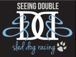
About Our Logo |
|
Where did Seeing Double's logo come from?!
Well, when Kristy and Anna's sister Kat learned the twins were going to race the Iditarod together for the first time in 2012, Kat decided they really needed a website to get their story out there. The twins helped her with the content and ideas for the site, and of course weighed in on what exactly to call themselves. The final naming convention came together pretty easily based on a simple "who" and "what"... Seeing Double + Sled Dog Racing. Tah-Dah!! And why "sled dog racing" and not "dog sled racing"? Kat had the same question and was promptly told a musher races sled dogs while standing on a dog sled ~ apparently this is common sense among those in the know.
Kat also soon realized that Seeing Double would need some kind of consistent logo. So she turned to friend and then-colleague Dana and, after describing pretty loosely what she was thinking, asked Dana to put pencil to paper. The twins really liked what Dana designed, so Kat took it to friend and fellow South Shore High School grad Heather at Idea Design Studio in Iron River, Wis. Heather took Dana's sketch digital, made a few different color schemes, and added the paw print. And so Anna and Kristy's Seeing Double Sled Dog Racing logo was born!
What ideas are ultimately underlying our actual logo design? Well the 'seeing double' is an obvious direct reference to Kristy and Anna being identical twins. And we've already clarified the 'sled dog racing' aspect - being mushers is a huge part of who Anna and Kristy are and certainly an enormous part of what they do. But let's take it all a little further...
Seeing Double Sled Dog as an acronym is SDSD ~ split that in two and create a mirror image of the second half intertwined and you have SD DS. The two interlocked D's are reminiscent of the front of two sleds coming together. The two D's are also from Double and Dog, and we all know the dogs are doubly important (insert paw print)! The two S's are transformed into rivers or the winding trails the twins and their dogs often follow. And if you let your imagination do some minor gymnastics, you can picture the two D's tipping onto their sides and atop one another to form a capital B for Berington. We would have good fun animating our logo if we only had the knowledge, skills, and software! One of these days...
|
|
|